
Now I will show you how to create a stylish and effective banner which you may use on your website.
First of all we need to create a new document with the size of canvas 500×300 pixels and fill it with color of #2d164d.
Then use the Rounded Rectangle Tool and draw the form bellow with any color.
Then we use following layer styles for this layer: Gradient Overlay and Stroke:
And we get this:
Then create a new layer over and merge it with the previous one to get all effects in one layer. Now we apply the Drop Shadow layer style to received layer:
Get the effect which you may see at the picture bellow:
Let’s add some volume to our banner. In order to do this we use the Dodge Tool (130 px, Range: Midtones, Exposure: 25%.) and make darkening on left and right side.
After that we load selection with Select > Load Selection, then create a new layer and use the Gradient Tool to fill selected part of the layer with the gradient from white to transparent at the top and the bottom of layer.
Then remove selection with Ctrl+D and then change layer mode to Overlay.
And the last step for design of entire banner. We need to add some glare. In order for this we create a selection across the banner’s form (Ctrl+left click the first button Layer Thumbnail in the Layers Palette). The use the Elliptical Marque Tool, hold down Alt and cut the piece of the selected area. You have to get the same result as on picture bellow.
After that we use the Gradient Tool and fill the gradient from white to transparent on the new layer.
Remove the selection by using Ctrl+D and change the layer mode to Overlay. Then apply Drop Shadow layer style for current layer:
Get this one effect:
Now we may add some information to our banner. In the beginning we may bring the tracery to our banner. For these purposes we may use these brushes. Load selection of banner again (Ctrl+left click the first button Layer Thumbnail in the Layers Palette), create a new one layer and put the print of brush into the selected area.
Remove this selection with Ctrl+D and change the layer mode to Overlay, then set up opacity to 30%.
Now we adjust the sharpness by using Sharpen Tool (Brush: 200px, Mode: Normal, Strength:50%).
Now, I would like to add a picture. Let’s use Google Pictures or sites of stock clip-arts. I found this one. Open image, separate it from background by using Polygonal Lasso Tool and copy it to our main canvas, make it a little bit smaller and rotate by using Ctrl+T.
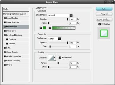
After that we’re going to highlight the flower. For this effect apply the Outer Glow layer style for current layer:
Get this effect now:
Let’s create a new layer and merge it with the previous one to get all effects in one layer. Now select the banner’s form (Ctrl+left click the first button Layer Thumbnail in the Layers Palette). After that invert the selection using keys Ctrl+Shift+I and press Delete to delete everything abroad the banner.
Now, remove selection with Ctrl+D. It’s time to add the text information. Use the Horizontal Type Tool and type the string ‘New Spa Saloon’ with white color.
Font we’ve used above is Avant Garde Gothic – commercial font. In this way you may use any other font if you don’t have this one. Now apply to this text layer Drop Shadow layer style:
Now we get something like this one:
After that, type one more string like ‘Click here to enter’ underneath with the color of #80bb00 using the same style of layer.
And the last thing what we need to do is add the name. Type the word ‘AQUA’ using white color.
Apply the following Blending Options for this text layer: Drop Shadow and Outer Glow:
We should get the result of applying layer styles at the picture bellow.
At this point our lesson is finished. I hope it was useful and interesting for you, do not feel shy to make experiments and you shall get great results. Good luck!
First of all we need to create a new document with the size of canvas 500×300 pixels and fill it with color of #2d164d.
Then use the Rounded Rectangle Tool and draw the form bellow with any color.
Then we use following layer styles for this layer: Gradient Overlay and Stroke:
And we get this:
Then create a new layer over and merge it with the previous one to get all effects in one layer. Now we apply the Drop Shadow layer style to received layer:
Get the effect which you may see at the picture bellow:
Let’s add some volume to our banner. In order to do this we use the Dodge Tool (130 px, Range: Midtones, Exposure: 25%.) and make darkening on left and right side.
After that we load selection with Select > Load Selection, then create a new layer and use the Gradient Tool to fill selected part of the layer with the gradient from white to transparent at the top and the bottom of layer.
Then remove selection with Ctrl+D and then change layer mode to Overlay.
And the last step for design of entire banner. We need to add some glare. In order for this we create a selection across the banner’s form (Ctrl+left click the first button Layer Thumbnail in the Layers Palette). The use the Elliptical Marque Tool, hold down Alt and cut the piece of the selected area. You have to get the same result as on picture bellow.
After that we use the Gradient Tool and fill the gradient from white to transparent on the new layer.
Remove the selection by using Ctrl+D and change the layer mode to Overlay. Then apply Drop Shadow layer style for current layer:
Get this one effect:
Now we may add some information to our banner. In the beginning we may bring the tracery to our banner. For these purposes we may use these brushes. Load selection of banner again (Ctrl+left click the first button Layer Thumbnail in the Layers Palette), create a new one layer and put the print of brush into the selected area.
Remove this selection with Ctrl+D and change the layer mode to Overlay, then set up opacity to 30%.
Now we adjust the sharpness by using Sharpen Tool (Brush: 200px, Mode: Normal, Strength:50%).
Now, I would like to add a picture. Let’s use Google Pictures or sites of stock clip-arts. I found this one. Open image, separate it from background by using Polygonal Lasso Tool and copy it to our main canvas, make it a little bit smaller and rotate by using Ctrl+T.
After that we’re going to highlight the flower. For this effect apply the Outer Glow layer style for current layer:
Get this effect now:
Let’s create a new layer and merge it with the previous one to get all effects in one layer. Now select the banner’s form (Ctrl+left click the first button Layer Thumbnail in the Layers Palette). After that invert the selection using keys Ctrl+Shift+I and press Delete to delete everything abroad the banner.
Now, remove selection with Ctrl+D. It’s time to add the text information. Use the Horizontal Type Tool and type the string ‘New Spa Saloon’ with white color.
Font we’ve used above is Avant Garde Gothic – commercial font. In this way you may use any other font if you don’t have this one. Now apply to this text layer Drop Shadow layer style:
Now we get something like this one:
After that, type one more string like ‘Click here to enter’ underneath with the color of #80bb00 using the same style of layer.
And the last thing what we need to do is add the name. Type the word ‘AQUA’ using white color.
Apply the following Blending Options for this text layer: Drop Shadow and Outer Glow:
We should get the result of applying layer styles at the picture bellow.
At this point our lesson is finished. I hope it was useful and interesting for you, do not feel shy to make experiments and you shall get great results. Good luck!


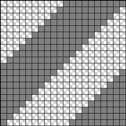 Before we start on the actual image, we first need to create a simple pattern which we will use later. Create a new document with dimensions 20x20px then go edit>preferences>grid... and use these settings. Create a new layer (Shift+Ctrl+N), hide the background layer then set the foreground color to #808080. Now recreate the image shown here using whatever method you feel comfortable with, the polygonal lasso tool is a good choice for what we want to achieve. Now save the pattern by going edit>define pattern, after saving, close this document. When making patterns like this one it is important to make sure that they will repeat when tiled, there are various methods of achieving this like the offset filter, however with a pattern this simple it easy enough just to visualize it.
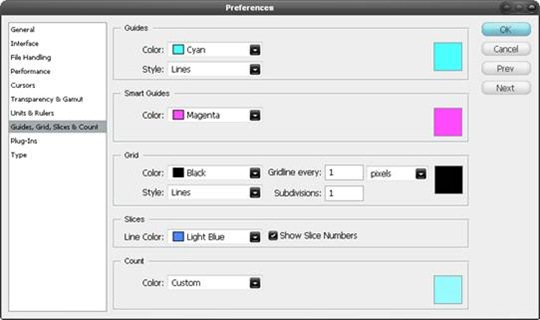
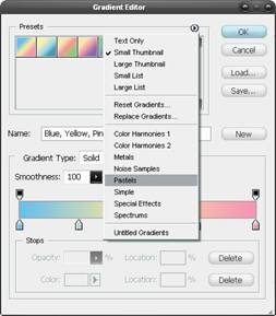 Create a new document, this time with dimensions of 1024x768px then select the gradient tool (G) and open the gradient editor. Click the arrow in the presets box and choose pastels, select the first gradient in this set. Using a linear gradient drag from the bottom of the page to the top, holding Shift to keep it vertical. Lastly change the opacity of this layer to 75%. A gradient is always a strong way to begin a piece like this but does require a texture over it.
 Here we will create our background texture, first find a simple image of clouds, the one I used can be found
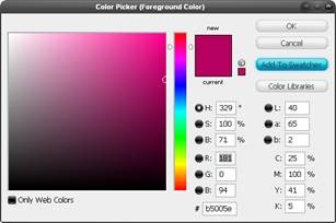
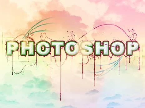
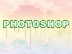
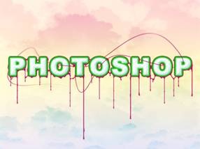
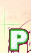
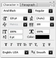 Okay now for the text, start by creating a new layer group named 'foreground', it will become clear why we did this later on. Select the text tool (T) and draw a text box that goes from the left of the page to the right. Type your text in then highlight it all and go window>character to bring up the character settings. Use all the same settings as shown here. The reason for the wide character spacing is to allow enough space for the borders we will add.
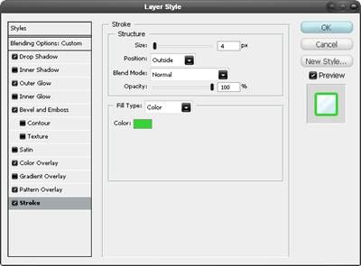
 The next few steps will show how to add some goo and drips to the text. Set the foreground color to the purple swatch then create a new layer group named goo directly below the text, still within the foreground group. Create a new layer within this group (Shift+Ctrl+N). Use the line shape tool (U) and create lines like the ones shown here, make some with the weight set at 2px and some with weight at 3px to add some variety.
 Create another new layer within the goo group. Using the same brush, decorate the text a little more to achieve a result similar to below. This step can take a few tries to get right but is quite enjoyable at the same time.
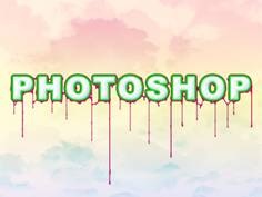

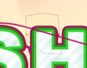
 Create a new layer group named lines, this time above the text layer although still in the foreground group. Create a new layer then select the pen tool and draw path, making sure to hold and drag after each point to ensure the path is smooth. Next right click on the path and select stroke path and don't check simulate pressure. The result should be similar to below. On these brushes, using simulate pressure will blend out both ends of the line which is not what we want here.
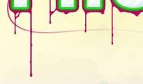
 Try adding some more lines using the same method shown in the last three steps. Try also changing the brush size to either 2px or 1px or switching on simulate pressure.
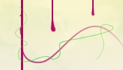
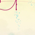 A quick way to make some random dots is to first select the brush tool, using a 2px hard brush then hit F5 to open the brush editor. Use the same settings as shown here and use the blue swatch we created earlier. For this brush we can drag it, note how the dots will be random and will give different effects depending on how fast you move the cursor.
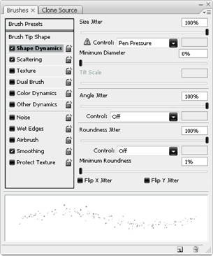

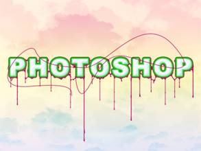
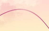
 Another nice detail that is simple to make is these blue lines. First create a new layer then select the blue swatch then the brush tool and use an 8px hard brush. Use the pen tool to create a large arc, mine went roughly from the 'H' to the 'O', now stroke the path and make sure simulate pressure is checked. Use the eraser tool to get rid of half of the line and to blend it slightly. I created three of these.
 The text is looking nice now however the foreground and background are like to separate images at the moment so we will learn a few ways to make them harmonize better. A good way to approach this problem would be to create an in between layer which is kind of half and half and can bridge the gap between foreground and background. Start by creating a new group within the foreground group but below everything else in that group. Create a new layer in this group then go image>apply image then edit>transform>warp and drag only the boxes here to warp the image, make sure that when your warping the image it still covers the entire document or else you will be left with sharp edges.
  Now select this layer then go layer>layer mask>hide all, change the foreground color to white then use a few of the following brushes with medium opacity to unhide some of the content on this layer, make sure the layer mask is selected rather than the layer itself.
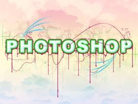 2. A floral brush of medium to large size. This looks good on a slightly higher opacity brush as well as on low. Never drag these brushes, it just doesn't work.
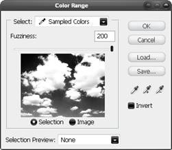 You will notice with the image we have at the moment, the clouds are only in the background. Let's solve this problem; we have to choices here, we either add more in front of the foreground group or we can take something away from the foreground. I've found that the taking away method produces a more realistic result. However if you have some cloud brushes kicking about feel free to use them but in this image I didn’t. First let’s check where we are at in terms of layers; at the moment you should only have a foreground group, a background group and the white background layer, everything else should be contained within these. In the background group duplicate one of the cloud layers then drag it out of this group and to the very top of the layer stack. Change the blending mode to normal then go select>color range and pick the very darkest part of the image and use the settings shown below, OK. Now you should have a rough selection around the clouds, hide this layer then select the foreground group and in the layers panel click the layer mask button at the bottom.
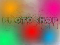 The last step is to add some color adjustments to the whole image. Start by creating a new layer above the foreground group then select the gradient tool and create a gradient like shown here. Use a radial gradient setting an create a blurry circle, go back to the gradient editor and change the color and do this again until you have something that resembles below. Lastly change the opacity of this layer to 50% and the blending mode to color. One last adjust that I save until last is to move that cloud layer that we duplicated to the top of the layer stack, unhide it then change the blend mode to soft light; I'll let you decide on the opacity this layer should be.
